


Preface
The text you are about to read was written in the year 2010. After Scala, Telefont, Seria and Nexus, which are discussed in this text, I designed a few more typefaces: Questa (2016) and Comma Base (2021). This text may have lost some of its topicality, but I still stand firmly behind my ideas and philosophy.
[Martin Majoor, 2023]
My Type Design Philosophy
In 1986 I graduated from the Academy of Fine Arts, Arnhem, with a serif type design called Serré. When I was given the opportunity to digitize it at URW in Hamburg in 1984, this became my first experience with computers. Serré was never released; but in hindsight, I realise it has provided the preliminary groundwork for my later typefaces. Subsequently I designed four major type families – Scala, Telefont, Seria and Nexus – adding new features with each new project. Yet, in all those years my ideas and principles about type design did not fundamentally change. Time for a personal retrospective.

Gouache drawings for Serré (1983). Me working at URW, Hamburg (1984)
The headache of mixing type
It is my conviction that you cannot be a good type designer if you
are not a book typographer. I am not talking about display types but
about text types. A type designer must know how type works in a piece
of text; he must know what happens with type on different sorts of
paper; he must know how a typeface behaves with different printing
techniques.
As a book designer I have worked on several complex books in which
more than one typeface were needed in order to clarify things in the
text. It is often quite useful to mix a sans with a serif typeface,
but the problem is always which ones to choose. It is common to mix
Times New Roman and Helvetica simply because both these fonts are
available in the computer. It is not even the worst possible
combination one can think of. Using sans serifs such as News Gothic,
Gill Sans or Futura as text type is definitely acceptable, but with
which serif faces can they be combined? Unfortunately, numerous
combinations end up being used with no sense of style or knowledge of
history. From an aesthetic point of view, combinations such as
Garamond/Univers or Bodoni/Gill Sans produce a severe headache, and it
is only in advertising (where a headache can be useful) that these
combinations are possible. It became clear to me that the best
solution for complex text was to use a combination of a serif and a
sans that share a common ground. But which combination of serif and
sans could meet this criterion?

The origin of the sans
Before the mixing of serif and sans in text can be explained, the origins of sans serif typefaces should be clarified, as it is only for about the last hundred years that they have been in use. Officially, the very first sans serif typeface used in print was published around 1816 by the English typefoundry of William Caslon IV. This Two Lines English Egyptian was a display face which only contained capitals.It is not clear where the rather clumsy forms originated. As a design, this sans serif typeface has little value.

Sans display face by the typefoundry of William Caslon IV, around 1816
Akzidenz Grotesk, published in 1898 by the German Berthold typefoundry in Berlin, is much more interesting. This sans serif immediately became a great success and was soon imitated by several typefoundries. Like all sans serifs of the time, Akzidenz Grotesk was meant to be used as a display face (the German word Akzidenzschrift means display face or jobbing type), however as it also included a lowercase it was suitable for text. But what was the basis for Akzidenz Grotesk?
The first printing types date from the 15th century, and consisted of serif typefaces that imitated handwriting. When the sans serif typefaces appeared in the 19th century they could only be based on the serif typefaces that were in use at that time. Most of the Akzidenz Grotesk weights were probably cut by experienced but anonymous punchcutters at Berthold and other foundries rather than by individual type designers.

Akzidenz Grotesk, published in 1898 by the Berthold type foundry
This means the punchcutters had to have a general idea of serifless
forms, and they could probably only derive these ideas from the then
popular classic typefaces such as Walbaum
or Didot.
This can be seen clearly upon superimposing Walbaum and Akzidenz
Grotesk characters. The ground form, or skeleton, of both typefaces is
identical.
Akzidenz Grotesk and Walbaum superimposed upon each other
Yet these classisistic typefaces were far from good examples on which to base a sans serif. In Walbaum the thin tail ends in characters like the ‘c’ and in numbers such as ‘2’ and ‘5’ are elegant, but when these thin parts are simply made thicker, it would end up in a sans with almost ‘closed’ forms. Because Akzidenz Grotesk could have been derived from Walbaum, mixing the two in text would give an acceptable combination.

The thin tail endings in Walbaum
In 1916, exactly one hunderd years after the first sans serif was
published, the English master calligrapher Edward Johnston designed a
typeface for the London Underground. The capitals of Johnston
Sans were clearly based on Caslon Old Face, but the lowercase
was a result of the calligraphic skills of Johnston. It was the first
time a sans serif was not based on an existing serif typeface, but on
handwriting with a broad-nibbed pen.

The London Underground alphabet by Edward Johnston, 1916
Eric Gill, an extraordinary type designer by all standards, started
his career cutting letters in stone. When he began designing printing
types, he knew by heart what a serif typeface should look like. He
designed Gill
Sans in 1928, and although this is a sans serif, he used his
experience as a letter-cutter of serif letterforms. While he may not
have realised it, he based his Gill Sans on the serif typefaces in his
head. Mixing Gill Sans with his seriffed Joanna
(1930) results in a typographically harmonious page. Joanna is a sort
of Gill Sans Avec! Had Eric Gill planned Joanna and Gill Sans as one
family he would have been the first in history to design a family of
serif and sans.

Gill Sans (1928) and Joanna (1930)
In 1927 Paul Renner’s Futura
was released. This sans serif typeface was not based on the watered
down classic letterforms on which Akzidenz Grotesk was based; instead
he started his drawings from scratch. It would seem that Futura was
influenced by the ideas of the Bauhaus movement and constructivism as
its letterforms look very much constructed, even though they aren’t at
all. Instead, Renner based his Futura on classic principles, like
roman inscriptional capitals. This was one of the reasons for its
success; it is a very well balanced text typeface, yet it has the aura
of the then popular Bauhaus movement.
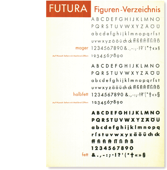
Futura (1928), type specimen
Around 1957 Helvetica
and numerous lookalikes were published as a sort of reaction to
pre-war geometric faces like Futura. These typefaces were all based on
the old Akzidenz Grotesk, and in no time they became extremely
popular. Basing a sans serif on another is rather cheap, so it is not
unusual that these typefaces had hardly any new features compared to
Akzidenz Grotesk. Pretending to be better than Akzidenz Grotesk,
Helvetica was actually bereft of the character and charming clumsiness
of Akzidenz Grotesk. Rock bottom was reached in 1982 when Arial
was published, an almost one-to-one copy of Helvetica, it was the
ultimate plagiarism of plagiarism.

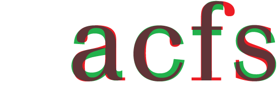
Akzidenz Grotesk (1898), Univers (1954), Helvetica (1957), Arial (1982)
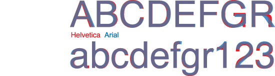
Arial (1982), an almost one-to-one copy of Helvetica (1957)
Of all the Akzidenz Grotesk imitations, Univers
(designed by Adrian Frutiger in 1954) had one strong feature that was
new in type design: it was made up of an almost scientific system of
21 weights and widths that could be mixed perfectly. It was an sublime
answer to the jungle of different sans serif faces that lacked a clear
system of weights and widths.
Univers was completely redrawn in 1997, to more than 60 versions. Unfortunately this has not been an improvement; there are now too many superfluous versions, the justification is too tight and the italic that was already quite slanted (12°) has been slanted to a staggering 15.5°. Redesigning an old successful typeface is something a type designer should maybe never consider.

The original Univers specimen from 1954, showing its 21 version system
The italic form of the sans serif
Most sans serif typefaces have an italic that is not more than a slanted version of the roman. Take for example Univers italic: the only thing in which the italic can distinguish itself from its upright version is the degree of the slope. A too small slope wouldn’t make the difference, therefore Univers Italic has a fairly large slope of 12°. In a real italic the construction of the italic is the decisive factor. This means that the slope of a real italic can easily be between 1° and 9°, because the shapes of the italic are basically different than that of the roman.
Again, the italic in Akzidenz Grotesk is nothing more than a sloped version of the roman. But an essential question arises: why was the italic not based on a real italic? A real italic has a different form principle than the roman, and it seems not so difficult to make an Akzidenz Grotesk italic that is based on, let’s say, Walbaum italic. This is demonstrated in the below illustration.

Akzidenz Grotesk Italic as it could have been (interpretation: Majoor)
It is possible that with the huge competition among different
typefoundries, the 19th century punchcutters were under great pressure
to produce quickly and therefore had to imitate others. A real italic
version was probably too much work or too difficult to make, while a
slanted roman was relatively easy to copy from the roman.
The idea of a slanted roman became widely accepted for sans italics,
even until today. With a few exceptions all sans serif italics are
slanted romans. Even the great type designer Adrian Frutiger made
slanted romans with his sans serif designs. It was only recently, when
his Frutiger
typeface (1977) was redrawn in 2000, now with a semi-real italic
instead of a slanted roman, that he acknowledged that a real italic
makes a better contrast with the roman.

Frutiger with slanted roman. Frutiger Next with semi-real italic
Typefaces like Futura
have slanted romans too, but in this case it is much more
understandable as there was no real old serif model on which to base
the italic. Futura looks like a constructed typeface that borrows its
forms from geometric squares and circles, giving it a truly original
type sensibility. The italic of Futura was released three years later
than the roman. Renner used the term schräg
(oblique) rather than kursiv
(italic) to emphasize the constructed character of Futara italic.
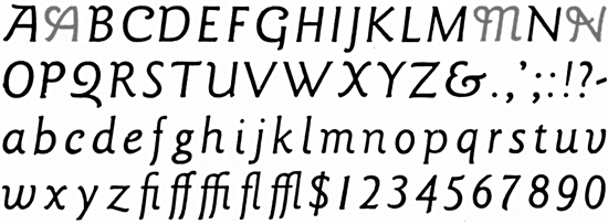
An interesting italic is that of Gill Sans (1928). It is probably the first among the sans serifs that has true italic characteristics. Even though the italic has some slanted roman shapes (e, f, g, m), Gill’s first sketches for Gill Sans italic show some very calligraphic features. It is therefore a semi-real italic.

Sketches for Gill Sans italic (1928-1929)
Another italic that should be mentioned is Frederic Goudy’s Sans
Serif Light Italic (1931). It was designed to accompany his
Sans Serif Light (1930), even though in Goudy’s own view a sans serif
typeface didn’t need an italic. Sans Serif Light Italic is a wonderful
calligraphic sans, and almost a real italic, including swash capitals
for A, M and N.
Frederic Goudy’s Sans Serif Light Italic (1931)
In my opinion, mixing serif with sans only makes sense when the serif and the sans typefaces are both derived from the same foundation, or even from the same skeleton. It sounds simple: take a serif design, cut off the serifs, lower the contrast, and there you have a sans serif. But of course there is more to it than that.
The first conscious attempt to design a sans based on a serif typeface was undertaken by the Dutch type designer Jan van Krimpen. In the early 1930s he designed Romulus and Romulus Sans to be part of a big family. Superimposing the serif upon the sans shows how literally Van Krimpen based them on each other. Romulus Sans was cut in four weights but unfortunately it remained at an experimental stage and it was never released.

Superimposition of the serif version and the sans version of Romulus
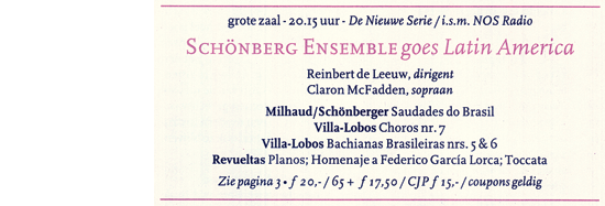
I started designing Scala in 1987. At that time I was one of two graphic designers at the Vredenburg Music Centre in Utrecht, a large concert hall that programmed more concerts than any other hall in the Netherlands. We worked on one of the first models of Apple Macintosh, using PageMaker 1.0, with only 16 typefaces to choose from. I was typographically educated with lowercase numbers (also known as old style figures), small caps and ligatures, none of which were available in these 16 PostScript-fonts.
The concert programmes, booklets and posters contained very diverse information, such as composers, titles, conductors, orchestras, soloists, time, date and venue. In order design this information effectively, we needed lowercase numbers, small caps and ligatures. And so it happened that Jan Willem den Hartog, the head of the graphic design studio, asked me to design a typeface especially for Vredenburg. The result was Scala, named after the Teatro alla Scala, the concert hall in Milan.
On 17 November 1989 Scala was officially launched at Music Centre
Vredenburg in Utrecht. Jan Willem den Hartog, the then head of the
design department, secretly designed a poster/type specimen, which he
presented to me at a special launch party. This all came totally as a
surprise, and the poster would become the
first type specimen of Scala. The first official use of
Scala was in January 1990 for the ‘Vredenburg Utrecht Maandagenda’
(monthly magazine). One year later Scala was released by FontShop
International as FF Scala.
First use of Scala for Vredenburg
(design: Jan Willem den Hartog, 1989)
The form principle of Scala was definitely influenced by humanist
typefaces such as Bembo, and by typefaces from the mid-18th century
French typographer Piere Simon Fournier. But I wanted Scala to have
low contrast and strong serifs, as I had experienced that most
PostScript-fonts were too thin. The italic was more or less based on
the work of the 16th century Italian writing masters like Arrighi,
although to a large extent the details were closely related to the
roman.
During the design process of the Scala family one thing was obvious to me: I wanted the lowercase numbers to be included in the normal fonts, and not in a separate Old Style Figures (osf) font. This was against the rather illogical tradition of putting the table figures in the normal font.


The method of changing Scala with serifs into Scala Sans
Scala Sans was literally derived from Scala. Using a black marker and
some correction fluid, I changed the serif characters into sans. The
result was that Scala Sans became ‘humanistic’ in appearance. Until
then this had rarely been seen in sans serifs, the only notable
exceptions being London Underground, Gill Sans, Romulus Sans and
Syntax (1968, Hans Eduard Meyer). The Syntax roman is truly one of the
most beautiful sans serifs ever, but unfortunately the accompanying
italic was a slanted roman. It was probably too early for Meyer to
free himself from the generally accepted ideas of how the sans of an
italic should look like.

Syntax roman and its italic
After I had designed the lowercase numbers for the sans serif, I
discovered that until that time old style figures had not been seen in
sans serif typefaces, even Eric Gill never made them for his Gill Sans
(although in the 1990s they were added by Monotype). Strangely enough,
Renner was the only one who designed them for his Futura, although
they are seldom used.

Old style figures in Futura and Gill Sans
The Scala Sans italic follows the forms of its serif counterpart quite
literally. There are italic small caps, ligatures and old style
figures, making Scala the first family with all these features in both
a serif design and a sans design, and in both roman and italic.

When I was designing Scala and Scala Sans my motto became: ‘two
typefaces, one form principle’. This can be demonstrated by isolating
the common skeleton of the roman and the italic in both Scala and in
Scala Sans.

Roman and italic skeletons of
Scala and Scala Sans
I exercised great freedom in executing my ideas regarding serif and
sans thanks to the possibilities of new digital design technologies.
And since I did not work for a typefoundry, there was no time pressure
and the music centre trusted me completely. Under these circumstances
I was able to think very freely about the concept of serif and sans.
Many of the generally accepted ideas did not seem logical to me; as an
independent designer I was luckily not obliged to follow them.
Scala was released in 1990 by FontShop International as its first
serious text face, but it was only when Scala Sans was issued three
years later that the family became extremely popular. The combination
of a serif and a sans typeface turned out to be a very useful
combination for graphic designers around the world. In 1997 I
augmented Scala with other weights such as light, black and condensed.
I also designed a set of four display versions called Scala Jewels.
> Find out more about Scala > Buy Scala here
In 1993-1994 I designed Telefont List and Telefont Text for the Dutch national telephone book. The typeface I had in mind was a sans serif, yet I did not resort to using a serif typeface as the basis for the sans. I was able to use the experience I had gained in designing the Scala family, however, compared to my work on Scala Sans, I had to think in a much more restricted way.
Telefont List (which I designed first) was to be used in a small size on cheap paper, it had to take up as little space as possible, and it had to be much more readable than the worn-out Univers that PPT (Post, Telefonie, Telegrafie) had been previously using.
Simultaneously I was thinking about the typographic redesign of the phone book itself. This proved to be a great advantage as I could now fine-tune the typeface as a result of the changes I made in the four-column grid and, what is more, I could adjust the page layout after I had made changes in the typeface. It is a rare situation, but an ideal situation for a type designer. In any case my experience as a book designer came in handy.

Telefont List is a real workhorse, to be used in the automatically generated phone book listings, while Telefont Text was designed for the custom-made introductory pages using many more typographic refinements such as small caps and old style figures. I was wont to put it as follows: ‘The most-used typeface has the least possibilities; the least-used typeface has the most possibilities’.
Telefont List and Telefont Text have been used exclusively for the Dutch phone book since 1994, but it is not inconceivable that they will be released in the near future. However I am not planning a Telefont Serif, as I do not believe in deriving a serif design from a sans.
> Find out more about Telefont
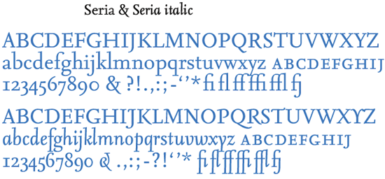
I made the first sketches for Seria on the train from Berlin to Warsaw in the summer of 1996, using some table napkins from the dining car. Designing Seria was born out of dissatisfaction with the use of Scala in a literary context. As a book designer I could not use Scala for poetry and other works of literature, as I found the ascenders and descenders too short for this purpose. I thought of making a version of Scala with longer ascenders and descenders, but then realised I wanted to change more than just a few details. I decided that Scala is Scala and if I wanted to make changes I would have to make a new typeface with long ascenders and descenders (I had no intention in making the most economical or space-saving typeface).

The table napkin sketches of the Seria family
I soon found myself working on a completely new typeface. The
individual characters of the Seria family have a lot of subtle details
and unconventional curves that can best be seen in a large size. In
small sizes, while one cannot see these details, one can maybe ‘feel’
them. The rather edgy curves make Seria ‘wittingly irregular’, a
principle that was used by W. A. Dwiggins, the American type designer,
and also by my Dutch colleague Bram de Does. It comes from the belief
that a certain degree of irregularity leads to better legibility. The
upward italic has become a major feature of Seria.
The need to augment Seria with a sans serif version was obvious to me from the start. Again using a black marker and some correction fluid, I changed the seriffed characters into sans. Making it stand out as a sans serif, Seria Sans kept the long ascenders and descenders as its seriffed partner. The strength of Seria Sans also lies in the consistent derivation from Seria, obviously noticeable in its italic and bold italic forms.

In 1999, a year before finishing Seria, I was asked by Tadeusz Wielecki, composer and director of the Warsaw Autumn Festival in Poland, to do the graphic design for this music festival. Not only did I design the poster, the leaflet and the CDs, but I also redesigned the inside typography of the programme books. I became the type designer and book typographer at the same time, and it was the perfect chance for me to use and to test the newly designed Seria and Seria Sans. The result was so clear that we have not changed the typography of the books since.
> Find out more about Seria > Buy Seria here
At the time Scala and Seria were designed, my motto had been ‘two
typefaces, one form principle’: the serif version and the sans version
coming from the same source, or better the sans being derived from the
serif. One doesn’t need a lot of imagination to think about a third
version, a slab serif derived from the sans by simply adding thick
serifs to the sans characters. My initial type design philosophy of
‘two typefaces, one form principle’ is simply changed into ‘three
typefaces, one form principle’.
I call this the ‘nexus principle’, nexus being the Latin word for connection. From 2002 to 2004 I designed Nexus, a family of three ‘connected’ typefaces including a serif, a sans- serif and a slab serif version. I still believe that the serif should come first, than the sans serif, and finally the slab. The addition of the word ‘Mix’ in the name ‘Nexus Mix’ is a result of my idea that a slab serif is really a mixture between a sans and a serif.
Roman and italic skeletons of
Nexus Serif, Nexus Sans and Nexus Mix
Nexus started as an alternative Seria with shorter ascenders and descenders, but the design quickly became it’s own typeface with additional changes in the proportions and details, including a redrawn italic. The result was a workhorse typeface similar to Scala, with added features like small caps in all weights, four different sorts of numbers, ligatures etc.
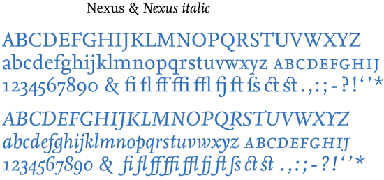


In addition to Nexus italic I designed Nexus Swash italic, which
includes two sets of swash capitals and two sets of swash lowercase
endings (long and short). Another version is a corporate mono-spaced
font in four weights, Nexus Typewriter. The lowercase ‘m’ has a
special shortened middle stem in order to make a more regular
appearance.

Nexus Swash italic (left) and Nexus Typewriter (right)
When the Nexus family (Nexus Serif, Nexus Sans, Nexus Mix, and Nexus
Typewriter) was released in 2004, it was one of FontShop’s first
OpenType font families.
> Find out more about Nexus > Buy Nexus here
The contemporary sans serif
Most of the older sans serifs were based on an empty-headed idea of how a sans should look. These designs are more or less imitations of each other, without their designers knowing why their forms are as they are (Helvetica and Arial are the most obvious examples).
It was not until the 1980s that serif/sans families started to appear. The serif members of these families are mostly based on traditional shapes, but the sans serifs are contemporary sans serifs, based directly on its serif members. In most cases the italic weights of these contemporary sanses are real or semi-real italics, not sloped romans. To mention a few: ITC Benguiat (Ed Benguiat, 1977), Lucida (Kris Holmes and Charles Bigelow, 1984-1985), Stone (Sumner Stone, 1987), Rotis (Otl Aicher, 1989), Scala (Martin Majoor, 1990-1993), Quadraat (Fred Smeijers, 1992-1996), Charlotte (Michael Gills, 1992), Legacy (Ronald Arnholm, 1993), Eureka (Peter Bilak, 1998-2000).

Nine contemporary typefaces, all with a serif and a sans version
When I started with type design in 1983 I produced only a single serif typeface. It has taken me twenty years to get where I am now, with my latest typeface Nexus consisting of three complete versions.
In a way, the last 15 years have been revolutionary for sans serif typefaces. As more type designers become aware of the origins of sans serifs, sans serif designs become full partners of alongside serif designs. Maybe the next 15 years will bring a revolution for slab serifs, and in the future it might even be possible that the ‘nexus principle’ expands into a fourth or fifth dimension. Time will tell.
Afterword 2023: the fourth dimension
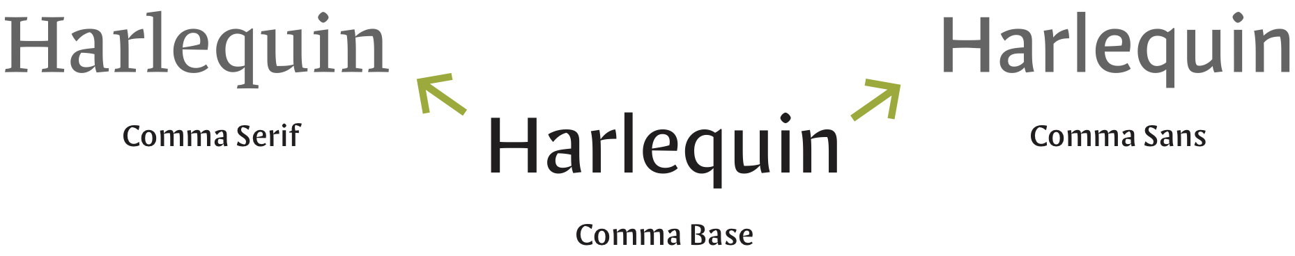
Since my last afterword a lot of things happened. The Questa Project was released in 2014. It is a typeface superfamily, containing a serif, a sans, a slab and a matching display version. The Questa Project is a collaborative project by Jos Buivenga and myself in which we kind of recreated the history of Akzidenz Grotesk with a ‘real’ italic companion, as I described in the article above.In 2021 I launched my own type foundry named ‘Martin Majoor’. In the same year I launched my typeface Comma Base, a uniwidth typeface with half the features of a sans (no serifs) and half the features of a serif (contrast). It can be seen as a missing link between serif and sans, a base from which a sans and a serif can be derived, hence the suffix ‘Base’ in its name.
This might be the fourth dimension I was talking about in my 2005 afterword. And how will the fifth dimension look like? Can we develop this even further?
Again, time will tell.
Martin Majoor
This article was first published in “tipoGráfica” # 53 Buenos Aires, Argentina, (2002) under the title ‘My Type design Philosophy’. An updated version of that text was published under the title ‘The Nexus principle’, in the book ‘Made with FontFont’, edited by Jan Middendorp and Erik Spiekermann (2006)
In 2010 this article was again updated and extended, to be used on
this website. A preface and an afterword were added in 2023.
