

Scala in use
The award-winning Scala & Scala Sans have become worldwide bestselling fonts. In the world of fonts, Scala is now considered a ‘digital classic’.
To mention just a few examples of its use: KLM Royal Dutch Airlines, The Museum of Contemporary Art in Chicago, Los Angeles Mertro, Taschen Verlag, Humboldt University Berlin, Treaty of Lisbon 2007, Lexus Cars, JBL Sound Systems, Chicago Manual of Style, Bodies: The Exhibition.
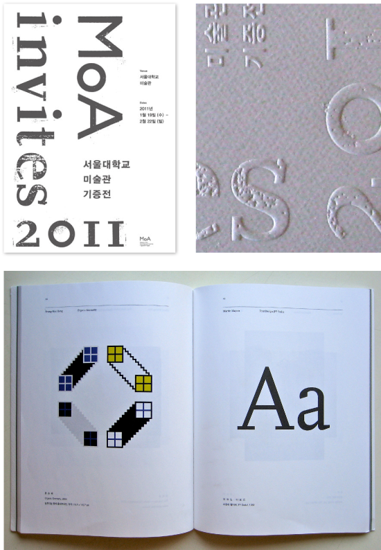
In 2010 the MoA (Museum of Art, Seoul National University) in Korea acquired Scala for its permanent collection, the ‘Design and Crafts’ collection.
Scroll down to see some of the best examples of Scala in use. It should be emphasised that in these examples Martin Majoor is only responsible for the typefaces, not for the design of the products themselves.
At the bottom you will find the first official use of Scala, in the
‘Maandagenda’ (monthly magazine) of Muziekcentrum Vredenburg in
Utrecht, dated January 1990.

The Netherlands women’s national volleyball team

Museum of Contemporary Art Chicago

Museum of Art, Seoul. Aquisition of Scala.
Taschen Verlag

Kunstmuseum Wolfsburg (1995-2001)

The Chicago Manual of Style (cover and inside typography)

Some book covers (different designers)


Algemeen Dagblad (Dutch news paper)

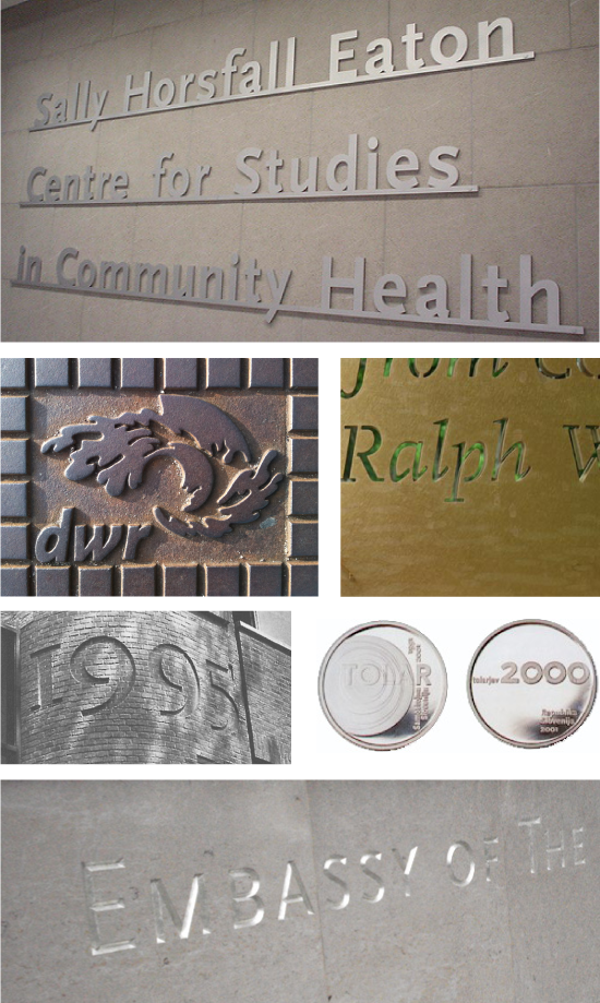
Scala in metal and stone
Some posters

KLM Royal Dutch Airlines

Scala in the street

JBL Sound Systems

Metro Los Angeles

Logos

Collins Publishers (design: Mark Thomson)

The Elements of Typographic Style (design: Robert Bringhurst)

Thinking with Type (design: Ellen Lupton)

Invitation and book — First use of Scala in US, design: Ellen Lupton, 1991-92

The beginning – First official use of Scala in the Vredenburg Maandagenda (design Maandagenda by Jan Willem den Hartog, 1990)
