


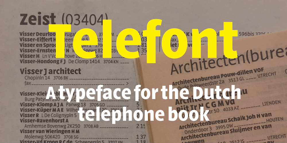
Telefont is a custom designed sans serif typeface that was used for the Dutch telephone book between 1994 and 2018. Majoor not only designed the typeface, simultaneously he was responsible for the inside typography of the complete telephone book, a rare but ideal combination for a type/book designer. There are two versions of Telefont:
Telefont List, a real
workhorse, to be used in the automatically generated phonebook
listings. It has four versions: Regular, Medium (added in 2004), Bold
and Italic.
Telefont Text, especially designed for the custom-made introductory pages using many more typographic refinements such as small caps, ligatures and old style figures. It has the versions Regular, Small Caps, Bold and Italic.

Read more
Four elaborate articles have been written about Telefont:A
usefull instrument ↗
Jan Middendorp for Items,
1994
Criticle
spirit of a telephone book ↗
Robin Kinross for Eye Magazine,
1995
Long
Distance Savings ↗
Peter Hall ID Magazine, 1995
New
faces | Telefont
↗
Emily King, 1999.
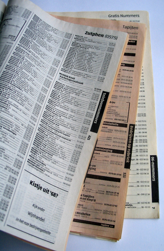
The Dutch telephone book from 1994

Original drawing for Telefont List, 1993
![]()